Self Portrait/ Propoganda poster


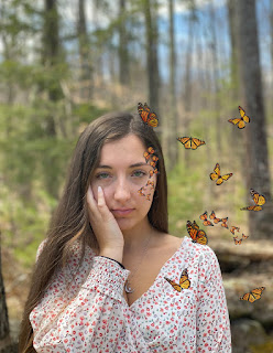
For my self-portrait I decided to use a picture my friend took of me over spring break because I was really happy in it and it was easy to see my profile features in it. I first started by outlining my entire body with vector shapes and putting every feature on different layers made things so much easier to layout. I tried to use an eye-catching color theme because for propaganda you want it to get the viewer's attention. I love the sun and being outside so I was inspired by a sunscreen propoganda poster I found online, I figured the one I made would be good as a propoganda poster maybe at the beach or in a beach shop to encourage people to wear sunscreen. This project took me a decent amount of time, probably around 8 hours. But overall this was a lot of fun for me, and I enjoyed seeing myself turn into a cartoon looking figure.

I really like the message you have in the poster "Sunscreen is a girls best friend" because it is something that would catch a girls attention, and they could relate to. I also really like how you you added the sun above you to further push your message. The gradient in the sun is very pretty. One thing I had a hard time reading is the sunscreen bottle. I know it is a sunscreen bottle based on the words in the poster, but it might work better if the image was more clear. I also think that putting a solid color behind the words "Sunscreen is a girls best friend" would help it to stand out better and be easier to read. I really like you project. Awesome job!
ReplyDeleteThanks Bailey! Those are good suggestions! I had a hard time trying to make the sunscreen visible so I probably should have played around with that more.
DeleteI love the self-portrait! I think you did a good job of accurately portraying the image you were trying to reflect and the colors in it are really vivid. The only thing I would do about the self-portrait is to add a little more detail by creating shading with the curvature/pen tool. As far as the propaganda poster, I think that's good too! The message is clear and concise, and the shading on the bottle is great. If there's one thing I would change, it would be to update the font on both the sun and the bottle, simply to make it more visible. I think another thing that would've been cool would be to include the sign behind you. Other than that you did a fantastic job!!
ReplyDeleteThank you! Looking back I also wish I had used the pen tool to add more detail to myself, I'll keep that in mind for the future.
Delete